Designing a brochure is probably one of the more rewarding projects in the field of graphic design. There is nothing more gratifying than creating something you can hold, touch, and read. In addition, design is more than just a layout, it includes texture and feeling that digital projects such as website design cannot convey. However, designing the perfect brochure can be intimidating. In addition to the issues that need to be considered for general design projects, there are also some things that need to be considered specific to print projects. Today, check out ten useful tips for brochure design!
1. Understand the printing specifications
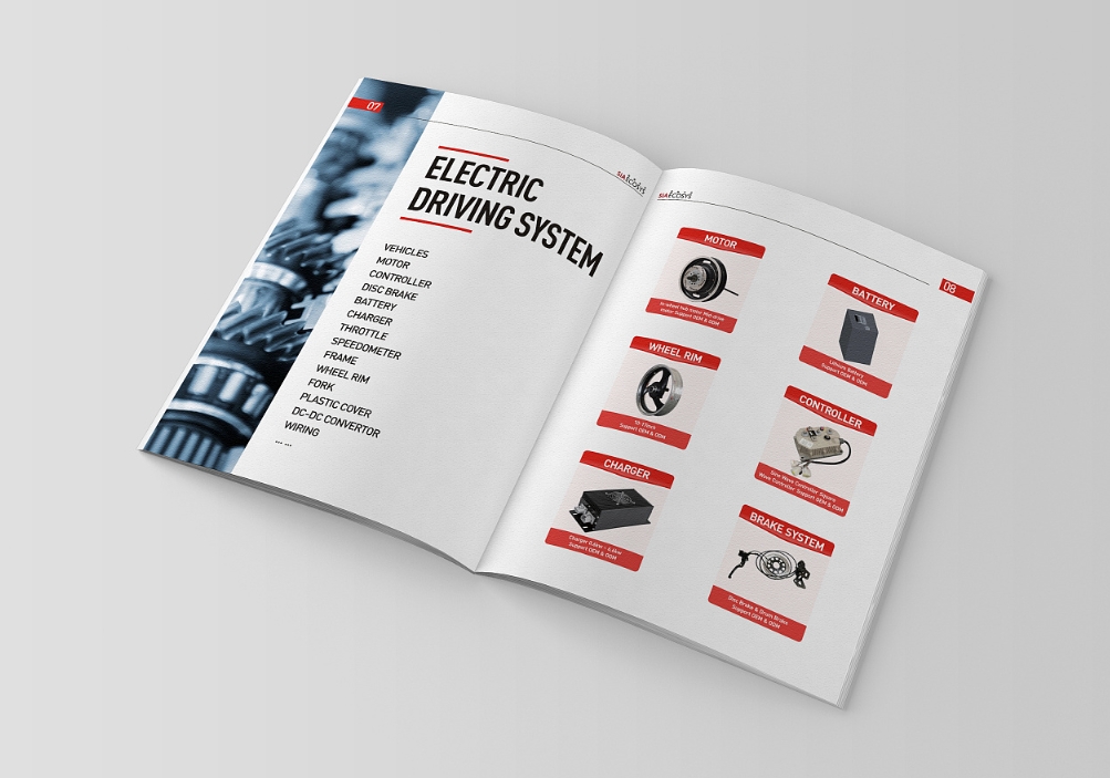
Unlike designing for digital media, such as websites, you need to know exactly what your budget allows you to print. This can affect quantity, size, paper stock and effects. Tip: Set the specifications for the brochure that belong to this project at the beginning. You know what you need and will create at the beginning. Consider things like paper size, folds and bleeds. It is important to understand the capabilities of the printer before diving into the design process. For thicker, smaller-format brochures, you may also need to consider the assembly format of the pages.
2. Carefully consider the needs of the user
The format and distribution of the brochure design should reflect the audience’s wishes. Even designs that look like traditional paper brochures can be transformed digitally through the interactive features of the PDF format. If you need to distribute brochures to your audience, consider a size and format that can easily fit into a pocket or bag. Finally, for stakeholders or key partners, a thicker or more durable, multi-page or larger size may be more appropriate. The last thing to consider is the audience – consider the age of the audience. Are they young or old? This will affect the type size and overall feel of the design.
3. Use high-quality elements
You can’t afford to use low-quality elements when producing printed materials. Low-resolution photos or illustrations can easily detract from and ruin the overall look. So, everything you use needs to be high-quality and high-definition to ensure your brochure design looks great. This includes images, illustrations, icons, logos, fonts, and a crisp color palette. Although you may not be able to achieve exact specifications and a uniform printing method depending on the project, generally you want images and design elements to be at least 300DPI in size.
4. Use textures
There are many physical features you can include in your printed brochure design. These elements help increase the perceived value of the information because it has a high visual appeal to the reader. Consider these effects: Foil: Add a glossy font or element to a part of the design. UV dots: Use a special gloss or matte finish on the design. Letterpress: Leave a raised mark on certain parts of the design. Folding: There are no limits on the form of folding, and interesting folding patterns can encourage user engagement. Paper: Different textured paper types can set the tone of the project. Die-cutting: Cut out sections of the design to create a mysterious transport through something else.
5. Don’t forget the call to action
One of the most common elements in print publications is the call to action. What is the purpose of the brochure? What should the user do after seeing or reading it? You need to make the purpose of the action clear to them. Whether it’s going to a location to attend an event or calling a phone number, establish what the user should do and encourage that behavior throughout the design process. The more pages or layouts a design has, the more times the call to action should be repeated.
6. Consider the display method
Where will the user see or pick up your brochure? Create a graphic design that still works in that environment. One of the most common problems with brochure design is forgetting that most brochure designs need to be adaptable to multiple display methods. Make sure the key visuals and information can be easily seen and read when extracted from the medium of presentation. Another key consideration is scale and size. How large does the brochure need to be designed? What is the optimal distance to maximize the user’s attention? Design elements should be scaled.
7. Stick to the visual theme
Use white or a highly visual color? Going for a single design or preparing multiple versions? Find a theme for the brochure design you are preparing and stick to it. This is important whether you are thinking about the design from page to page, such as the cover and the inner pages should follow the same theme, or you may plan to create multiple versions of a similar brochure. A unified theme sets the tone for the brochure and provides a consistent user experience for readers.
8. Prove and prove again
Nothing is more embarrassing than finding a typo or mistake after the brochure has been printed. Print and verify the design. Then give it to someone else to repeat the verification and checking process. Printing errors are quite expensive and you should avoid them as much as possible.
9. Choose high-quality paper
Believe me, the quality of the paper you choose can affect the success of users in accepting the design and information. In addition, it can also affect the technology used in the design process. As a rule of thumb, thicker paper is more flexible in the use of colors and printing techniques. At the same time, this kind of paper can make it feel more expensive and leave a deep impression on users. But this does not necessarily mean that thicker paper is better. Sometimes you may need a lower thickness or quality, especially if the print is high volume or needs to be distributed to a wide audience. When picking the style and feel of the paper, think about what the message is and whether they can match.
10. Design for print
Remember that the ultimate purpose of your graphic brochure design is to be printed. Use colors in CMYK format, create a bleed version, and pay attention to how readability continues in broken or folded elements when necessary. Sometimes it is difficult to imagine how a complex print design will look in real life. Create a copy at each key step as much as possible to ensure that the elements and pages in the brochure look as expected. Sometimes effects such as letterpress can look interesting, or die cutting can create a strange spatial design element. Pay attention and look for special problems that need to be solved during the design process so that your print work is successful.
Conclusion
Brochure design can be fun, but there are also many factors to consider. When you are faced with doubts, lean towards a simpler design, which can make it easier to imagine how it will actually print and prepare everything for the pre-press process.


