Banners are the physical manifestation of your business’ core message. A well-designed banner can communicate anything you need to your customers. However, the key term here is “well-designed”. How can you make sure your banner lives up to your expectations? Try these tips to create a strong banner design:
What’s the Objective?
Banners are effective for a wide range of applications, but the first step to designing a truly useful banner is identifying its usage. Ask yourself what the primary purpose of your banner is and what you plan to achieve with it. Take the time to write down your answers, as they’ll lay the foundation for your banner design.
Factor in the Surroundings
If you’re considering adding banners to your marketing mix, you may already have an idea of where you’re using them. When purchasing a banner, size and mounting is dictated by location. Generally, large banners are best for outdoor use, while smaller banners on banner stands are best placed inside or in close proximity to your store’s entry points.
Use the Colors to Stand Out
When you’re designing a banner, setting a color scheme is an important first step. Start from colors associated with your brand and expand to create a complimentary palette. When creating a color scheme, stick to only two or three colors total or risk a cluttered layout.
Of course, there are other factors to keep in mind, like the colors of any graphical elements or nearby surroundings that could make your banner blend into the backdrop. utilize color theory as well. Certain colors stimulate certain emotions, and the right choice in color will create the right attitudes towards your brand.
Focus on Quality and Resolution
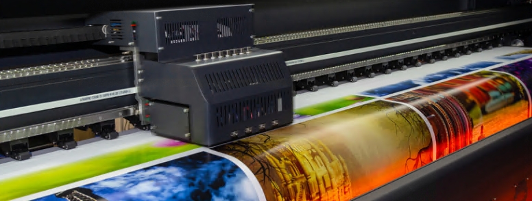
anners are often the first point of contact between your customer and your brand. A professional, high-res graphic will create a professional first impression. Always utilize high-resolution graphics at print-quality DPI, so that even when the final image is enlarged, it would look just as it did on your computer screen.
Ideally, design your graphics as vectors. Vectors have infinite resolution and can be scaled to any size without losing quality. Common vector design programs include Adobe Illustrator and CorelDRAW.
Ensure Readability
Images are an integral part of your banner, but your copy deserves just as much attention. Interestingly, an increase in the viewing distance makes images appear sharper, while proportionately, the readability of the letters reduces. Likewise, it’s important to settle on an optimum viewing distance that will strike the fine balance between the two.
Choose a font that is easily legible and write out a message that is short, succinct, and impactful. Utilize the Rule of 10 to 100: your letters must be at least 10 inches in size to be read from a 100-foot distance.
Create Focal Points
When it comes to banner design, less is more. Cluttering your banners with an array of messages and visual elements will overwhelm the viewer. The best approach is to create clear focal points and juxtapose with negative spaces. You can draw attention to certain parts of your banner by utilizing contrast, stress text, and playing with proportion.
Pick the Appropriate Material
Whether for durability or appearances, different banner materials have different properties that will affect your final product. For instance, satin banners possess an alluring sheen, but in sunny conditions, can create an unintended glare. While more plain, all-weather polyester banners make more sense outdoors. In short, research your materials and choose your banner wisely.


